Transmission #12.75: "La Renesanco"
Saninsakin!
Sorry for the silence; a lot of work behind the scenes has kept us thoroughly occupied!
Splendor & Misery's relaunch with v0.313 is still our focus at the moment, but we thought it might be best to tear the band-aid off for certain elements in advance, and provide our thoughts on some of the significant changes to the framework of the game itself. We've learned a lot between our work on TME and pre-v0.313 S&M, especially when it comes to assembling assets that eventually make it into your hands. We've had a lot of internal discussions when it comes to our changes, and while there still is an underlying anxiety to see how you all will react, we hope you'll understand that these foundational changes are ultimately being made to enable us to tell our story better.
The assets showcased in this devlog are from the latest internal build, and we welcome any and all feedback(!)–if things aren't working, we'd like to work on correcting that sooner rather than later. Certain elements, such as the backgrounds, are placeholders from earlier releases and will be replaced within the final build. For now, they've been inserted so that you can get the general feeling that everything together will provide.
The largest change (aside from the story) is the layout of the GUI. We've modified Katy133's incredible Disco Framework, and have created entirely fresh assets for the new format. This includes GUI elements and portraits for all characters featured within S&M. We'll get into this further later on in this, but for now, here's a mockup as an example, rendered entirely in-engine (featuring lorem ipsum):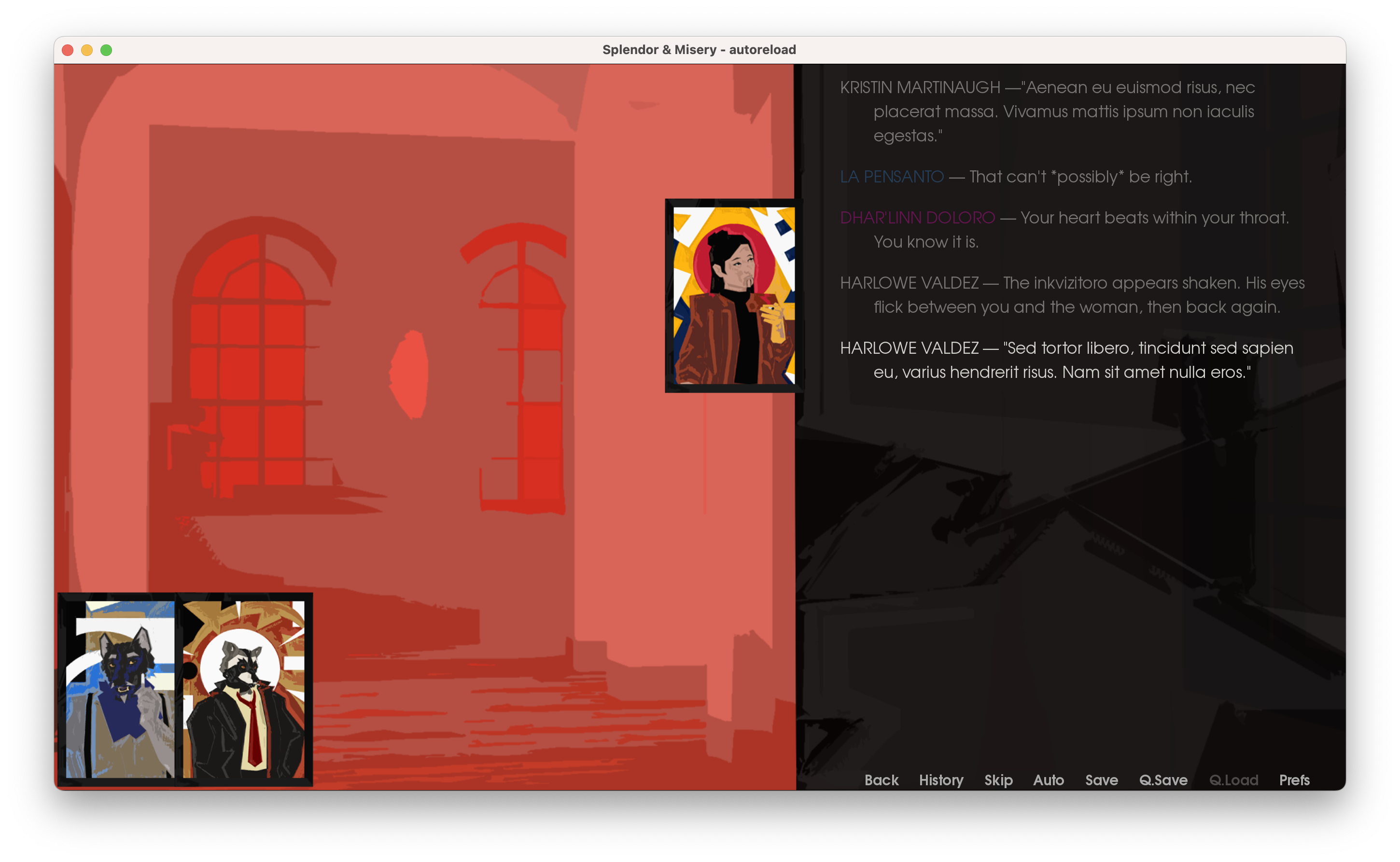
Another change is the resolution, which has been upscaled from the original 1280x720 to 1920x1080, meaning higher-quality assets than those originally featured in S&M. We know that S&M (and TME, for that matter) have been admittedly atypical in terms of presentation, so we hope that this presentation isn't too immersion breaking for those who've followed the project thus far.
We'd love to hear if there are changes (specifically to the GUI) that would make it better for you as the readers. At the end of the day, we're making these for you, so we want to be as accommodating as we can be.
This new format required us to revisit the foundations of the way we present the characters and environments. For a period we experimented with a blend of the TME format of backgrounds, and even isometric backgrounds, but will likely keep the backgrounds similar to how they were originally presented. We're still determining whether or not to include characters within them, as (admittedly) this slowed our production considerably.
Background Experiments (using the Senatrix's office as seen in Ep1Pt2)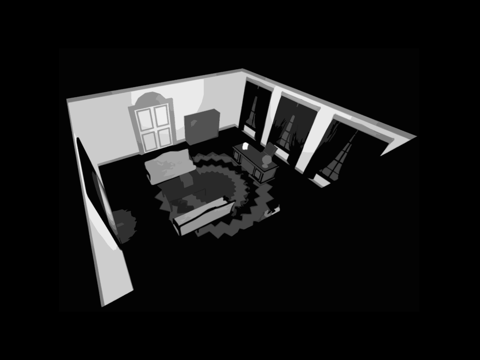
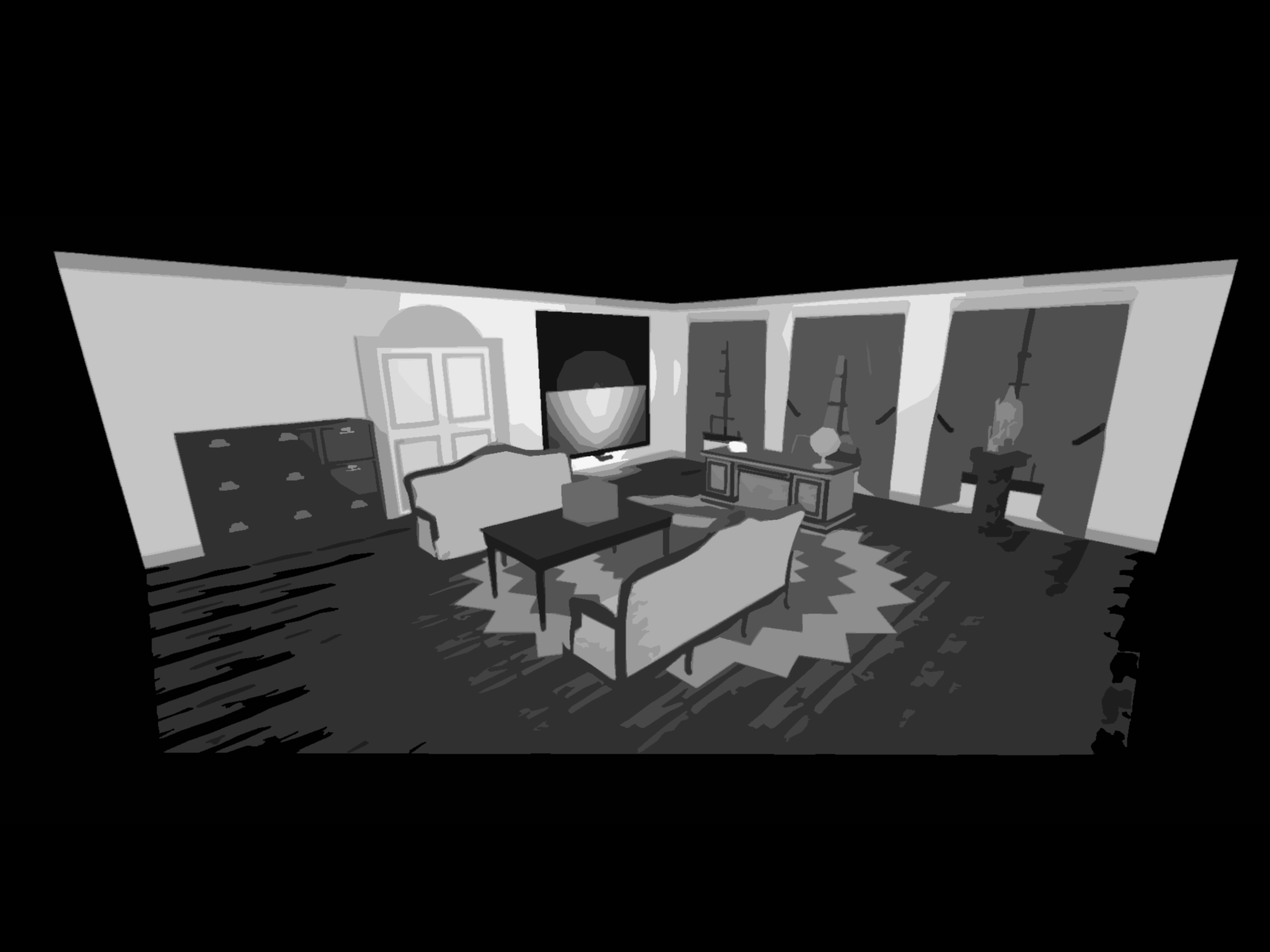
We ultimately decided against it, as it would've required us to completely overhaul how we design these environments. I'm not sure that I've ever actually explored it specifically, but these backgrounds are 3D environments that we model, then render and apply heavy post-processing to. You'd think that'd save time, and sometimes it does, but sometimes it really, really, *really* doesn't.
(Point is, isometric environments are really hard!)
Style-wise, our previous approach to character depictions wouldn't work. We're obviously wearing our inspirations on our sleeves, most notably Disco Elysium and Tails Noir (formerly Backbone), and their respective approaches to their character and environment depictions are just. I mean. C'mon. They're great!
In revisiting our characters (and having to adjust designs to reflect the 30/45-year gap between their previous depictions in earlier versions of S&M and the current release of TME) we wanted to reflect ideology through motifs present in their portraits.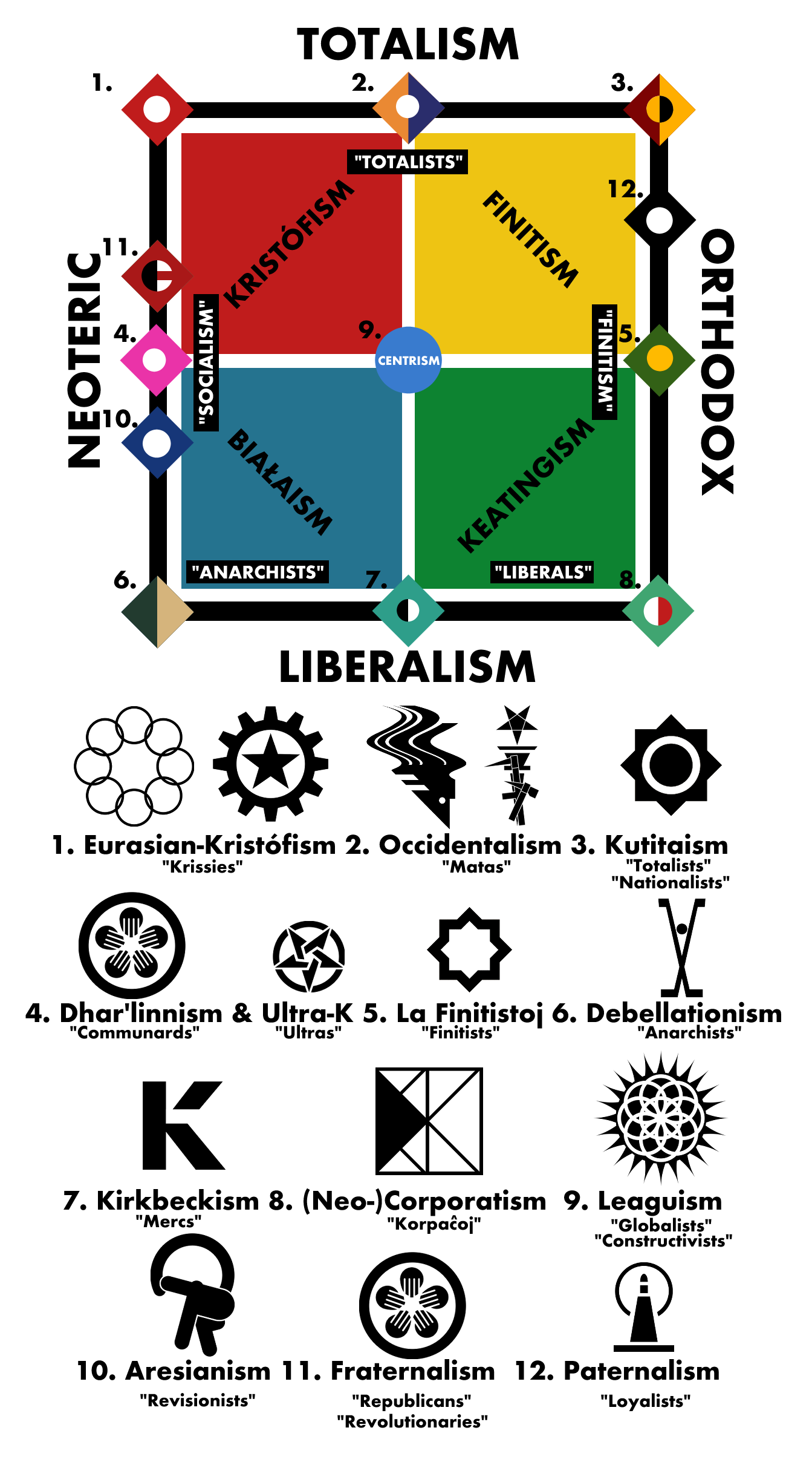
And so we came up with this. These are (almost) all major ideologies influencing events and characters throughout S&M and other works set within our world, using the largely meaningless presentation of an alignment chart. Certain terms may appear familiar, but trust us, they aren't! With nearly a millennium of alternate socio-political developments across three worlds, there isn't much overlap with our understanding of contemporary or even historical socio-political movements.
We won't bore you with the details, especially when fun things like libidinalism aren't even included in the overview, but the basic idea was to coordinate symbols and colors with the sprites we create for each character you encounter.
So, using this, we got to work on the portraits. The result?
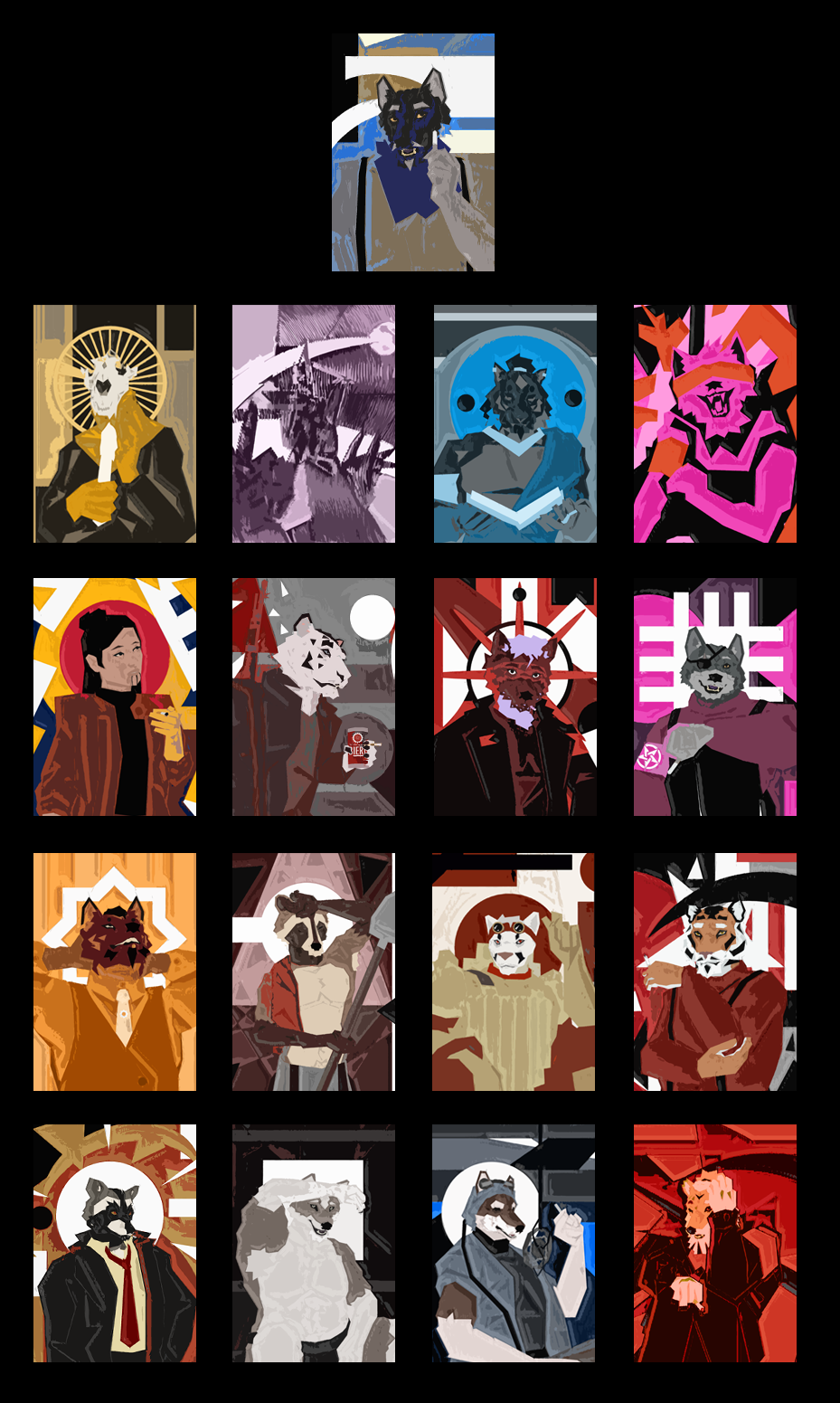
Portraits, portraits, and more portraits! These are the portraits which'll be featured within Episode 1.
Each has a high-resolution, uncropped form (shown in-game as 216x299 with the original being 1920x1920) which we've got on our end. For example, we have the portraits of Jensey and Harlowe:
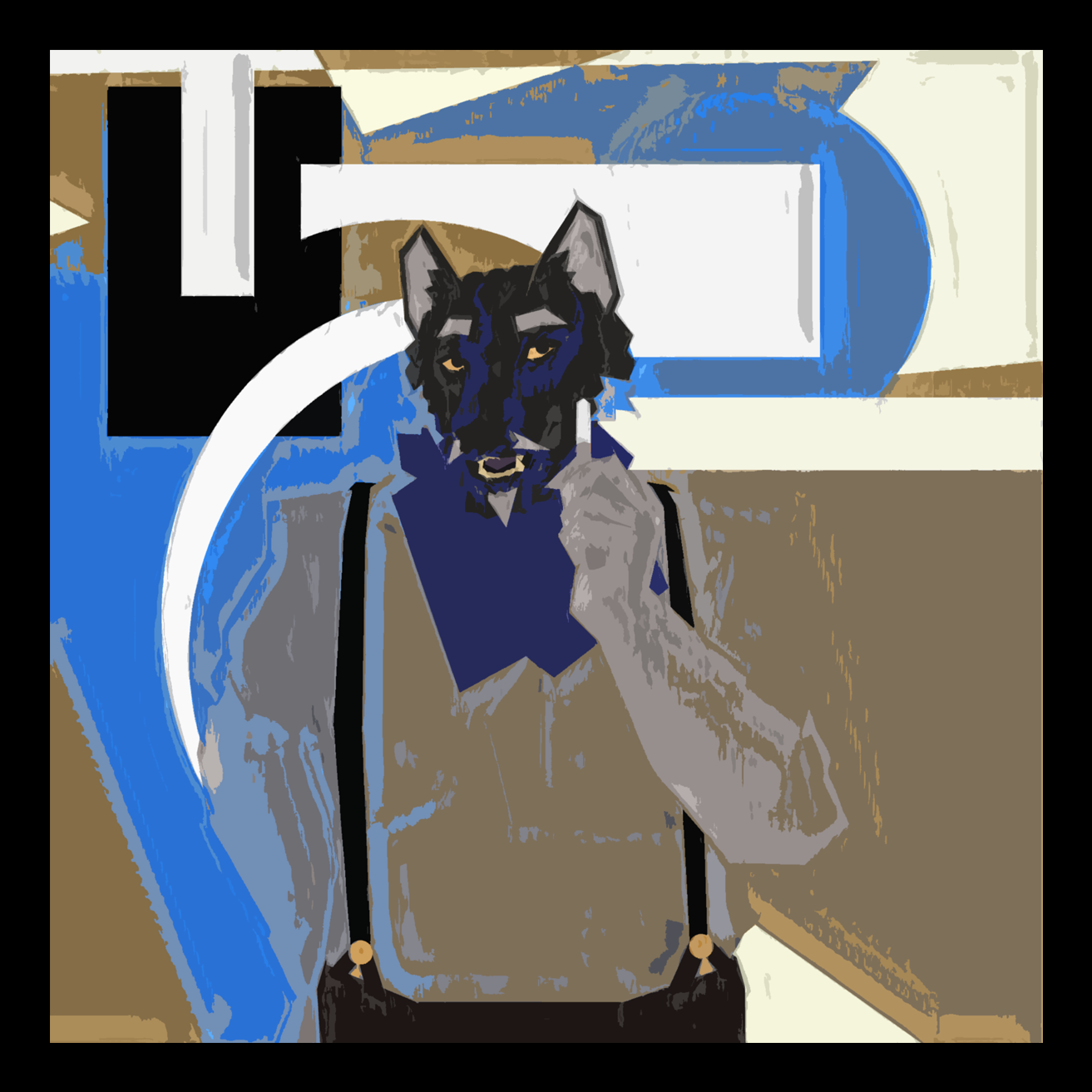
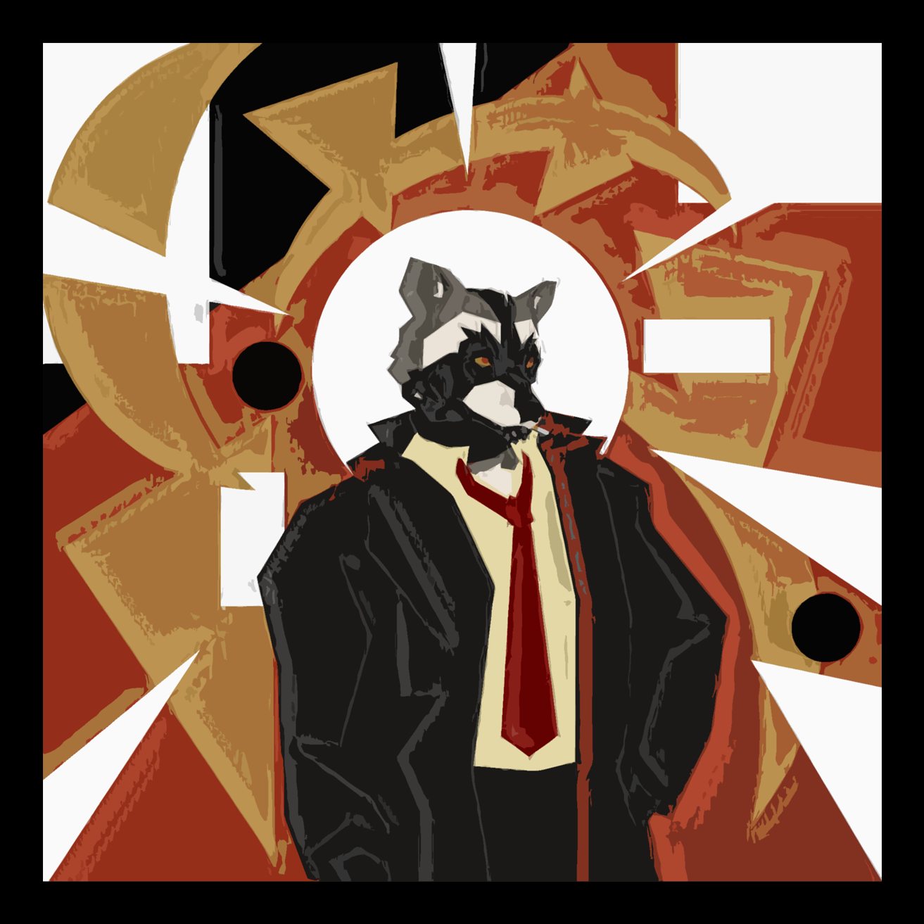
Given the imploding nature of their world, it was important for us to reflect that in the portraits. Some almost seem under siege, reflecting the boiling sense of persecution steadily building for the cast as things ramp up again.
Even the most unshakable ideologues you encounter still have a certain motion about them–things are in flux, or, for some, already collapsing. Others are bathed in the hues of their ideology, having it radiating from them *and* consuming them. Many attempt to shield themselves from the world's chaos, and a select few have shut themselves down entirely. It's a lot to communicate with backgrounds for portraits, and no doubt a lot of it isn't going to be immediately obvious, but that's a large part of the fun for us! How much can *you* trust the way that Jensey perceives those around him?
A lot of the inspiration for these came from the works of Aleksander Rostov, but we were also drawn to the works of Oswaldo Guayasamín, Eileen Agar, Frank Auerbach, and Paul Klee.
………
Anyways! Long story short, like we always say, we're working! It just takes time to move things along while balancing our personal lives and other commitments.
We would really like to hear what you all think of what we've got here so far, as we're keenly aware that it's quite a sharp turn from what we originally presented with the earlier versions of the VN.
As always, thanks for tuning in!
Til next time!
-Lajos
Got a question? Want to chat? We can be reached at ProjectUlysses13@gmail.com.
Get Splendor & Misery
Splendor & Misery
The Continual Whirr of Machines
| Status | In development |
| Author | Project Ulysses |
| Genre | Visual Novel, Role Playing |
| Tags | Furry, Gay, LGBT, Meaningful Choices, No AI, Sci-fi, Story Rich, Thriller |
| Languages | English |
More posts
- Transmission #16: "LIGHTHOUSE"Jan 22, 2025
- Transmission #15: "TEKTONO"Dec 26, 2024
- Transmission #14: v0.314Nov 13, 2024
- Transmission #13: "VIA VICO!"Oct 13, 2024
- Transmission #12.85: "La Revolucio"Aug 28, 2024
- Transmission #12.5: "Jetsam"May 15, 2024
- Transmission #12: "Droids… 2!"Apr 06, 2024
- Transmission #11: "Shipwrecked"Mar 29, 2024
- Transmission #10: "The Sprawl"Mar 20, 2024
Comments
Log in with itch.io to leave a comment.
<3
I didn't know I needed a Disco Elysium inspired FVN, but I'm sure as glad that someone had done it in such a beautiful way. Thank you for all of the great works and can't wait to read more of your projects!
How will the story be presented? Will we be able to choose the characters we play and what decisions they make throughout the story? Will we cycle through POV characters like the old version of S&M? Outside of these questions, the new UI, concept art, and backgrounds all look splendid! Good Job!
(Also, it might be a good idea to include an encyclopedia to help the audience keep track of the story's many ideologies and events, but that's only a suggestion.)
Very exciting!!! The character portraits look so badass. Also, love to see how much effort y'all are putting into all the ideological world building.